Thought of the Week – What will 2024 bring?
This is my last serious post for 2023. There will of course be the traditional Christmas edition, but otherwise, I will be back in January 2024. Before I go, I want to write about one of the most common chart crimes you can find in investment reports and on social media.

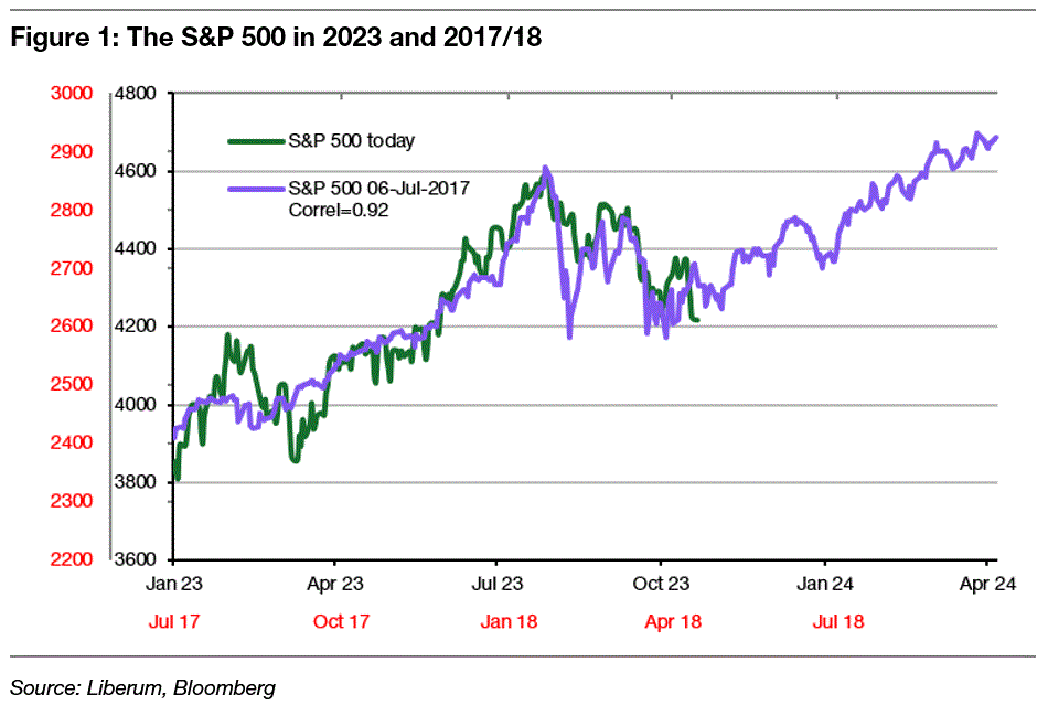
Most of us have seen these charts where current markets are compared to some historical developments, and they match quite well in the last 6-12 months or so. Then, the historical development is extrapolated into the future, suggesting that this time, the market will move along similar lines. You know, charts like the one to the left, that suggest that the first half of 2024 is going to be a really good year for the S&P 500. After all, the correlation between the S&P 500 in 2017/2018 with the S&P 500 in 2023 is a very large 92%. And in the six months after the end of the overlap, the market rallied by almost 10%.
If you think about it, the world today looks a lot like 2017/18. The US economy was expected to slow down after the Fed hiked interest rates from near zero. In fact, many economists expected a recession in 2018 or 2019, yet the US economy, while slowing down, remained incredibly robust and avoided a recession. This was a significant surprise and led to a rally in equity markets in 2018. Today, many economists are again surprised by the strength of the US economy in the face of massive rate hikes.
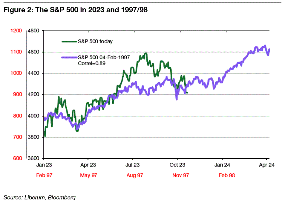
Or think of the analogy with 1997 below. In late 1997, the Asian Tiger States that had been heralded as the major growth miracle of the previous decades started to falter. Imbalances in their currency reserves created worries that these countries may need to devalue their currencies. Foreign investors quickly withdrew their money, thus accelerating the crisis and creating major problems in global bond markets. Today, another Asian growth story of the past decades is faltering. China is desperately trying to prevent its real estate sector from collapsing, but if it fails, the impact may be felt in other Asian markets and among holders of the debt of the struggling real estate developers.
But despite the crisis in Asia in 1997, the US market continued to rally, driven mostly by high-flying tech stocks that were defying gravity. If that sounds familiar to the current situation, it may be more than just coincidence.
Except that all of this is bs.
I made it all up. Or rather, I built a tool for myself, where I look at the recent history of the S&P 500 and then select the periods with the highest correlation going back to 1964. All I want to have is as high a correlation with 2023 as possible and at least a 5% rally in the six months after the overlap ends.
Once I had the charts, all I did was jog my memory (and Google) to come up with some plausible-looking analogies between today and these past episodes. My tool already guaranteed that the correlation between the market today and in the past would be extremely high anyway and that these analogies showed a strong market rally in the aftermath of the overlapping period.
To show you how useless these historical comparisons are, I created two more comparisons using the same tool, but this time I selected the highest correlation in the overlapping period and required stock markets in the past to drop by at least 10% after the overlapping period ended.
Here is the first chart that compares the S&P 500 in 2023 with the developments of 1970/71.
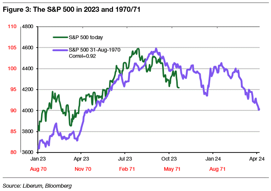
The correlation between today and back then is 0.92, just like the correlation between today and 2017/18. And in 1970, we had inflation coming down from a large increase in 1969 thanks to the Fed hiking interest rates to 9%, the highest level in three decades. Of course, these rate hikes killed economic growth and corporate profits, putting downward pressure on markets. Furthermore, public dissatisfaction with the Vietnam War was so bad that there were mass protests like the March on Washington in April 1971 and rising terror attacks by anti-war protesters in the spring of that year. Now all you have to do is replace the Vietnam War with climate activists and you have your doom and gloom scenario.
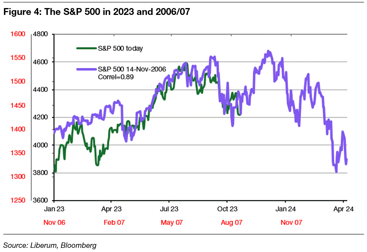
Or think of 2007 when the rate hikes by the Fed finally triggered a slowdown in the commercial and private real estate market that would eventually lead to the financial crisis of 2008. Back in late 2006 and early 2007, we thought that the crisis in the real estate market would be contained in some corners like sub-prime mortgages (trust me, I was there). Of course, it didn’t stop at the subprime mortgage market but spread.
Today, we are worried about US commercial real estate in cities like L.A. and think the market will correct, but these problems will not spread and become a major banking crisis… Oh and did I mention that there was a war in Israel in July 2006 when Israel bombarded Hezbollah bases all over Lebanon and enforced a blockade of Lebanon?
It is incredibly easy to come up with these suggestive charts for whatever view you have at any point in time. Thanks to my tool, I can create two bullish and two bearish charts within minutes and come up with a plausible narrative after a few Google searches.
But just because these charts are suggestive doesn’t mean they should be taken seriously. The lesson you should learn from today’s post is to completely ignore all these charts, always and everywhere. They mean nothing and they are most likely the result of heavy data mining by someone who wants to talk his own book.
Oh, and please, never ever send me one of these charts and ask me what I think of it – you know the answer.
Remember that predictions are hard, especially when it comes to the future. Fundamental research and analysis can come up with some plausible scenarios, but the uncertainty is always high. Just fitting one chart to another is not research, and certainly not a basis for investment decisions. If you invest your money based on these charts, you deserve to be separated from it.
Thought of the Day features investment-related and economics-related musings that don’t necessarily have anything to do with current markets. They are designed to take a step back and think about the world a little bit differently. Feel free to share these thoughts with your colleagues whenever you find them interesting. If you have colleagues who would like to receive this publication please ask them to send an email to joachim.klement@liberum.com. This publication is free for everyone.

