Thought of the Week – A complicated chart with an important message for fund selectors
I tend to think of myself as pretty good at reading charts, but the chart I want to discuss today had me stumped when I first saw it, and every time I go back to it, I still need a moment to get my head around it. But if you are a fund selector, an asset allocator, or a CIO, you definitely should try to understand what this chart has to say.

The chart comes from a new paper by Hendrik Bessembinder and colleagues and as always, when Hendrik publishes something, it is important for investment professionals to pay attention.
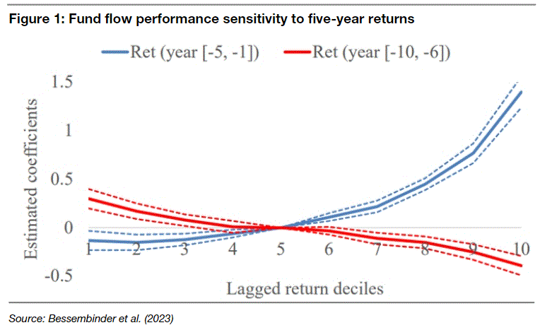
On the face of it, the chart shows the regression coefficients for monthly fund flows of US equity funds for return deciles based on previous 5-year fund returns. Easy, isn’t it?
Let me walk you through it.

On the horizontal axis you have all the funds sorted into deciles based on their 5-year fund performance. Decile 1 are the 10% of funds with the lowest return and decile 10 are the 10% of funds with the highest return. On the vertical axis, you have the regression coefficient for monthly fund flows.
Let’s start with the blue line in the chart. This shows the regression coefficients for fund flows based on the performance of the funds in the five years prior. The line indicates that funds in decile 10 (i.e. funds with the highest returns in the last five years) get the highest inflows from investors. The negative readings on the left-hand side of the blue line indicate that the funds with the lowest returns over the previous five years tend to suffer outflows.
Nothing new there. Investors mostly put their money into funds that have seen the best performance over the last five years.
Now look at the red line in the chart. It is downward-sloping and negative for the funds with the highest returns. This line is based on the return of the funds 6-10 years in the past. What the red line tells us is that funds with a strong performance 6-10 years ago tend to suffer outflows, while funds with a weak performance 6-10 years ago tend to see inflows.
What is going on here?
In essence, what the chart shows is two things. First, investors are chasing past returns. But on average, funds that have great returns in the last five years tend to have poor returns in the next five years. That means that investors who chase past returns and put their money into the best-performing funds of the last five years tend to underperform. How long do investors underperform? The red line in the chart indicates that fund managers have about five years before investors turn their backs on them. After five years of underperformance, there is no stopping disappointed investors from leaving the fund. My personal experience with investors is that five years is a long time. Most investors will get nervous after 6-12 months of underperformance and leave you after 2-3 years of underperformance.
Yet, this research points to a simple investment strategy for fund selectors. Look at funds that underperformed 6-10 years ago. These are the funds that tend to follow styles that are likely to come back into favour in the next five years. And that may have a better chance of outperforming going forward than the funds that did well in the last five years or so.
Thought of the Day features investment-related and economics-related musings that don’t necessarily have anything to do with current markets. They are designed to take a step back and think about the world a little bit differently. Feel free to share these thoughts with your colleagues whenever you find them interesting. If you have colleagues who would like to receive this publication please ask them to send an email to joachim.klement@liberum.com. This publication is free for everyone.

